It’s officially been a year since launching my new website redesign on the Showit platform. It had been a long, long time coming. So long, in fact, that by the time I launched a new site I had been offering services to clients that my old website only mentioned in a single paragraph for over a year & a half. For a girl who helps people get all of their communications & marketing strategy aligned for a consistent/seamless business… that’s pretty nutty. 🙈 But as they say, “cobbler’s kids have no shoes.” Whoops!
However, since launching my new site, I’ve realized just how powerful a website that really represents your brand can be. Doing the work for yourself can be some of the most difficult work of all, but it is also some of the most eye-opening. It without a doubt has helped me become a better communications & marketing coach because I’m able to see the pitfalls my clients could encounter.
I can take my experiences, see the path to come from a bird’s-eye view, and then come alongside my clients to navigate the path & build a road map with them.
One thing I find to be a common theme is that it’s hard to know when exactly it is time to launch a new site. You may not need a full rebrand, or even a full site redesign, but knowing that your time has come & feeling confident in investing in yourself & your business can be tough!
If you’ve been toying with the idea, I have 5 ways to know it’s time to launch a new website… because sometimes we just need a little confirmation we’re on the right track or a “nudge” to get on the track in the first place.
How to know it’s time for a new website redesign (or a website refresh)
Your brand has grown, but your website doesn’t represent the current quality you produce
One of the best things for our businesses it to recognize when our current website needs to be updated to represent the “big sister version” of our brand. Perhaps your work has improved significantly over the years, or even changed styles all together. Maybe you’ve transformed your process, meaning the quality of service & outcome is vastly improved from your “baby business” stage. If your website still looks like it is the infant version of your business, but you’re in the child, teenage, or even adult years of your business, then it’s definitely time for a website redesign. Your website redesign should showcase the best of the best of your brand – a powerful portfolio, testimonials, & calls-to-action that sell for you!
An example: until launching my new site, half of these features had never been showcased on my website. What a shame to miss out on an opportunity to showcase where my photography and/or words have been featured!
You offer new services or products
Does your current website showcase the breadth of services or products you offer? Perhaps you started as a wedding photographer, but now offer anniversary and newborn sessions to former clients. It’s time for a website refresh to allow your current work to do the marketing for you. One thing I absolutely love about using Showit is the simplicity with which I can duplicate a page to use as a starting point & make tweaks from there as my service & product offerings expand. It means the website remains consistent in design, but flexible in content. It also means I can add or take away services & products quickly… so I’m not fielding unnecessary inquiries for things I no longer offer.
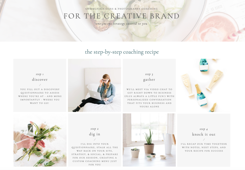
An example: I had been offering coaching sessions for a while but never had a place on my website that showcased the process & results these sessions yielded. I now use this one page more often than any other to share a peek at the coaching steps for anyone interested. 
Your current website platform or design just doesn’t serve you like you need it to
I mentioned above how much I love Showit’s simplicity. It’s the best website designer & host for people who know nothing about coding or HTML. In fact, I wouldn’t even consider myself super techy, yet I can navigate Showit with the best of them. When I first started realizing my old website just wasn’t cutting it anymore, I made a list of what I wanted out of a new website. One of the main things was the ability to easily edit the site on my own as my brand grew & transformed over time. When you’re launching a new website redesign as a multipassionate entrepreneur, you have to be prepared for changes to come. I used to use Squarespace – and while it was wonderful for a season, it wasn’t a long-term fix for me.
I constantly butted up against not being able to make the changes or additions I wanted… or having to hire someone to custom design it for me every time I wanted something new. I’m impatient & like things done when I want them done… so I knew that my old platform just wasn’t cutting it anymore. While I was scared to transition from a platform I’d used for over 3 years, I knew it was time for something new. If you’re feeling that way: explore your options and figure out what works for you.
If you ever have any questions about Squarespace vs. Showit or what it was like making that transition, I’m your girl. It wasn’t NEARLY as scary as I thought it would be… and now my website is leaps and BOUND beyond what I envisioned or dreamed of!
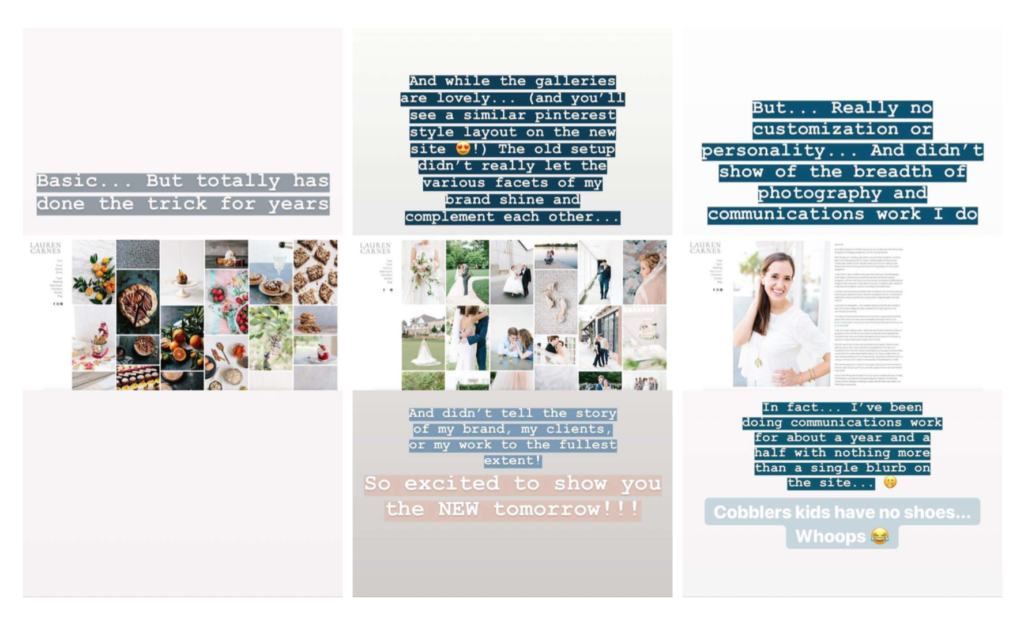
An example: You can see that yes, these screen shots of my old site showcased pretty photos… and they did the trick for many years… but what they didn’t showcase was: the stories of my clients & how I could serve them, my services & offerings, or even my brand story. It was pretty basic, but my brand had more dynamics to it… and I needed a platform that let me showcase those!

You made a “bandaid” website and then… never changed it
I know that feeling well. You get something up… just to get it up! You’re going to change it as soon as you get situated in business… you really are! But then… one thing leads to another, and you never really feel “situated” so a proper website is always on the back burner. What was once a bandaid fix has now become a staple in your business… and pulling off the bandaid is super hard at this point. It feels painful thinking of not only creating a site you SHOULD have created in the first place… but also one that represents where you currently are – and more importantly… where you want to go! If this is you, just go ahead and yank it off. You can learn all the details of what website template I used for my website redesign & how I had the template customized here!
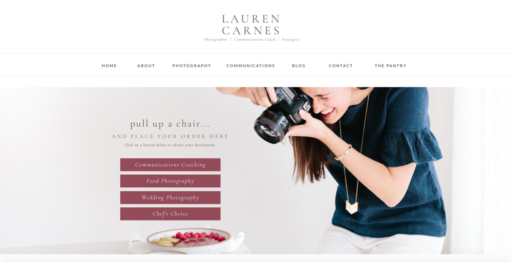
An example: The template I used from Davey & Krista’s The Palm Shop included two separate designs for your “above the fold” homepage opener. I used it as my starting point to create a site that allowed my audience & visitors to navigate quickly to what they were looking for… especially because I offer a variety of services. You can see that in the screen shot below where we created a “Menu” of sorts for the home page!
PS: You can get 10% off of any of Krista & Davey’s full website templates in the shop when you use the affiliate code LAURENCARNES at checkout!
Then I used similar “canvases” as Showit calls them (basically chunks of the website page) to create other pages to really make my site be so much more than an bandaid. Megan of Megan Martin Creative helped take it to the next level to ensure it was so “me” and spoke to and converted my ideal client quickly!

Your site looks just like everyone else’s & you don’t know how to set yourself apart
One of the most common reasons I hear people complain about not being able to grow their business… “the market is saturated.” However, that really doesn’t count as a valid excuse when you have the opportunity to brand your business and yourself to be set apart from the crowd. Every asset & place you showcase your work helps make that possible – and all should direct people to your website to learn more & contact you to book. With that being said, it’s so important that your website doesn’t just look like a cookie cutter version of everyone else’s. Sure you can offer the same services, but what is YOUR differentiating factor? What makes your website stand out and speak to your ideal client? A few resources for you to start the process of setting yourself apart on your website are:
How to prep for a brand photography shoot
How to use your story as a content creation gold mine
How to grow your business in a season of waiting
Finally, get access to my FREE Signature Brand Voice Recipe Guide where you’ll learn how to hone in on your unique brand voice & connect with your audience. As you’re thinking through: “Is now the right time for me to update my website and begin a website redesign?” – know that I’m always here to help. I’m beginning to open up limited space for my spring & summer Communications Coaching sessions, so if you’d like to walk through the process together, reach out to get on the VIP Wait List!
